Monday, 9 May 2011


Saturday, 7 May 2011
Friday, 6 May 2011
Evaluation Three: What have you learned from your audience feedback?
Audience feedback has been invaluable to us. To make as professional, well targeted, a promotional package as possible, we relied on outside opinions from our target demographic to offer unbiased critique on our work.
First impressions are important, hence we wanted a title which we felt represented our film and would entice our target audience. After drafting three prospective titles, based on a map of key words, we produced a survey to receive feedback on which our prospective audience found the most appealing. As well as the main question about our film's title, we included questions about the participant, such as their age and sex, how often they visit the cinema, and about their interests. This enabled us to not only discover the most popular title overall, but the title that was the most popular with our target demographic/audience.
To receive targeted responses from our key demographic/audience again, as we felt this was the most valuable audience feedback to us, we posted the first mock up of our teaser poster on to my fashion blog on Tumblr. In doing this, we were introducing ourselves to our absolute key audience; predominately females 18-34, with a strong interest in fashion modeling, who pursue this interest as recreation. We received quite a few comments, including:
"This looks interesting... but the combination of the shadowed background and hair falling across her face is giving off more of a thriller feel."
"Assuming the tape measure is the main focus, you may want to remove some of the other factors. The tape measure didn't catch my eye when I first looked at the poster, and it took me a while to realize what I was supposed to be looking at."
"This looks quite professional! It has a lot of potential, but there's something off... I think it's the top/skin/bottom proportions. They're uneven."
We found this feedback to be so valuable, because we too had felt something was off; but it took an outside, unbiased, critic to pinpoint exactly what was wrong.
With this constructive criticism, we were able to develop our teaser poster. We changed the orientation from portrait to landscape, cropping the head away to remove the thriller-like and distracting covered face and to equalize the proportions of the top/skin/bottom. We used this change of orientation to our advantage, creating a billboard teaser from the background of the posters for "Picture Me" and drawing inspiration for the style from the popular Calvin Klein campaigns. Having read that "the tape measure didn't catch my eye when I first looked at the poster", we hoped that, even though we had tidied the poster up and drawn better attention to the tape measure, should the tape measure still not catch some members of our target audience's attention, perhaps the pretention of a renowned fashion brand would.
We re-uploaded our new poster, and received much more positive comments. Most included acknowledgement of our Calvin Klein campaign inspiration, which was very re-assuring, and the user who commented before about the shadowing and hair combination said; "Much better :) The shadowing looks great now, much more atmospheric... more ominous instead of scary."
Whilst we really took advantage of audience feedback to develop our poster, and found it very valuable, we feel that we could have connected with our audience more during the development process of our website. We focussed more on drawing inspiration from and challenging the conventions of other websites we had researched, and, as we received very positive feedback from our classmates throughout the process, we did not feel that we needed to change anything. However, in hindsight, I wish we had also appealed for opinions from our target audience as we did with our poster, because at times we have wondered whether our poster has come out as too generic and not fashion orientated enough.
After editing the first sequence of our trailer, including the sequence to the intro of Paramore's "Decode", our production company logo, and a scene of dialogue between Cindy's character and her friend, we uploaded it to all of our Facebook accounts. With the majority of people on Facebook, uploading a section of our trailer to the site was similar to launching it to a sample of a "real world" audience.
The comments we received were positive about the music we chose, and felt the editing worked in sync. We received one comment from an 18 year old female (so in our target demographic), which said; "I feel really sorry for the girl in the intro. The scenes with her mother and boyfriend were very sweet and she looked so sad thinking about them." We were pleased that the intro had receive our desired sympathies from a member our target audience, and that she had realized that Cindy's character was reflecting on our past; it told us that we had edited the intro well.
However, the scene of dialogue after our production company intro (a scene between Cindy's character and her friend, walking towards a post box with an envelope, containing Cindy's modeling photos for the agency but this is never mentioned, whilst Cindy's friend asks Cindy if she "is sure she wants to do this", never mentioning what "this" is) received predominately negative feedback. For example, "I don't understand, what is the "this" they're referring to? Is it her modeling?" (which came from a friend who knew the theme of our film before watching) and "I don't think this adds very much to your trailer other than confusion, to be honest. Perhaps cut it?"
Having found audience feedback so valuable during the production of our teaser poster, we decided to trust it again and cut the small scene of dialogue.
- Trailer: We felt like scenes were moving too fast, Ryan "liked, didn't feel like he was missing anything, was definitely interested to see more." not so keen on font. He's opposite sex to our demographic, but has same interest in the arts and fashion.
The next time we shared our trailer with outside critics was after we had cut all of the scenes to fit our music, to both the "Decode" intro and the intro to Muse's "MK Ultra". The fast pace of "MK Ultra" had lead to our cutting our scenes quite finely to run in sync with it.
Evaluation Two: How effective is the combination of your main product and ancillary tasks?
As a promotional package overall, I think the combination of our main product and ancillary tasks is very effective.
Across all three products, we have used a minimalistic and exposing aesthetic, as we are representing our film, which is an exposé style drama about the modeling industry. We needed to make this clear to our target audience (females 18-34, cosmopolitan, with an interest in the fashion industries), and from our research we were able to understand icons of this theme; such as minimalism, powerful images, and references to fashion houses. To produce the best representation of our film, we considered all of these elements and incorporated the most representative into all three of our products.
Using a predominately monochromatic palette for our teaser poster and website were how we achieved our minimalistic aesthetic, and the stark images used in our teaser poster and trailer supported the exposé style we have attempted to achieve with our film. We downloaded the minimalistic Calvin Klein font and created a title for our film in Adobe Photoshop CS3 which we were able to use across all if our products, to enhance the references our film contains to the real fashion industries and stories for our audience.
Using the same title font across all of our products also acted as a constant, to make it clear to audience that each piece of material is promoting the same film.
As well as being consistent in style as a set, each piece of material also has its own strengths as a promotional tool, which, when combined, enables the whole package to have covered three different styles of advertising for three slightly different consumers. Should our film be being released, the teaser poster would be the first piece of promotional material released. It's simplicity allows for even the more passive members of our target audience to be able to consume the strong iconic image and the basic information we provide with little concentration.
Our trailer would be next to be released, developing upon the initial interest our teaser poster would have created by providing more information for members of our target audience who are a little more focussed. Finally, our website would be available for members of our target audience who have developed a strong interest in our film and would like to research more information. We, as a group, feel that the three stages of promotion our package establishes combined is very effective in reaching out to our target audience and creates the best chance of our film's success.
Evaluation One: In what ways does your media product use, develop, or challenge forms and conventions of real media products?
Trailer:
When planning and producing our film trailer, there were many elements of other films, television shows, and their respective trailers which influenced our group's decisions.
One of the trailers which we came to look to the most throughout our pre-production research was the trailer for Joel Schumacher's 2010 film "Twelve". "Twelve" is a film that touches on many similar themes to our own, and is targeted towards the same audience. The element to the trailer for "Twelve" that we found the most interesting was the retrospective opening.

The trailer for "Twelve" opens with a long panning shot of Chace Crawford's character, White Mike, at an emotional low point.

This single shot is intercut with flashbacks to the protagonist's most poignant memories; memories of his deceased mother. This effect is used as an establishing sequence for the audience. It establishes a key moment from the protagonist's past, which in turn establishes a key element to his emotional state and establishes how the following events shown in the trailer started to unfold in the film's world.
As a group, we liked this technique because it was quite unique and drew audience interest. (In an industry as competitive as the film industry, a drawing first impression from promotional material is essential to a media product's success.)
We used this technique with a similar single long panning shot of our protagonist at her low point, at the pit of her story; when she has become homeless. Although this showed a specific key moment in our plot, whereas the trailer for "Twelve" just showed an unspecified moment when the protagonist's low emotional state was open to the audience, we still felt this was not a plot spoiler; it's not the ending of our film, it's the pit of the protagonist's story. Rather than being a plot spoiler, we felt that it would be an incentive to the audience to see the film to see how the character recovers from the situation.
We considered using a still long shot which zooms into a close up shot of our protagonist, but felt that the pan, in the direct style of the "Twelve" trailer, worked far better. The pan's moving to focus on our protagonist on the street was a far better representation of this shot being from a passing person's (or the audience's) perspective, in contrast to the flashbacks which are from the perspective of our protagonist.
As in the "Twelve" trailer, we used literal flash transitions between our panning shot and the flashbacks. However, we developed upon "Twelve"'s use of poignant memories, which were used to establish their protagonist's mental state which was key to establishing their film's plot, by using happier memories, which establish the difference between where our protagonist has come from to where she is now, which is key to establishing our film's plot.
Other trailers we looked at also influenced decisions we made about the production of our trailer's opening. For example, we looked at the trailer for "Black Swan" as it is another film which touches onto similar themes to our own, and found it's use of color interesting.

The washed out effect represented the emotional draining Natalie Portman's character Nina suffered due to the strain of her career, and we decided to emulate this coloring on the panning shot in our trailer's opening with a color filter in Sony Vegas Pro 9.0 to represent the emotional draining of our protagonist due to the strain of her career.
We developed upon this technique by using a warmer color filter on the flashbacks in our trailer opening to contrast with our protagonist's drained, "cold", emotional state after her career has taken everything from her, with the happier, "warmer", emotional state she was in prior to modeling.
The same washed out effect was used in another trailer we looked at, for the documentary "Picture Me". In this trailer, washed out, over bright, coloring is used to represent the documentary's exposé style, "shining the light" on the modeling and fashion industries.

We decided to emulate this effect on scenes from our trailer which were inspired by true stories we had read about in the media and seen in other films and television shows, scenes which were more exposing. However, after showing a sequence from our trailer to our Media Studies class, who are close in age to our target audience, the feedback we received was negative towards this decision. Class members thought the differences in coloring on different scenes in the sequence made it feel disjointed. So, we reversed the decision and made the coloring on our trailer, post the opening, constant.
As mentioned, many of the scenes shown in our trailer were inspired by true stories we had read about in the media and seen in other films and television shows, and a few were inspired by fictional stories with an element of truth. This was because we wanted our film/trailer to have as high a level of verisimilitude as possible, and for us to be able to tell as honest and exposing a story as possible. For these stories, we looked to print and online fashion media sources which are targeted towards our audience (such as more "accessible", lower end fashion magazines like "Grazia", and more popular online fashion blogs like "The Cut"), and documentaries and television shows like "Picture Me" and "The Beautiful Life". We took themes from real stories, such as the sexual harassment charges associated with photographer Terry Richardson and often speculated about extreme diets/eating disorders, and developed upon them by amalgamating them into one plot.
We turned this plot into a sequence of key scenes for our trailer by editing to a piece of music with a strong beat and a mood which reflected our film, a technique we drew from, again, watching trailers for films similar to our own, such as "Twelve" and "The Social Network".
Post it's opening, the trailer for "Twelve" picks up pace with the song "Kids" by MGMT, to reflect the should-be innocence of the film's characters, before progressing into the even faster-paced and more erratic "MK Ultra" by Muse, to reflect the actual insanity and downward spiraling effects of their situation. As a group, we liked the use of "MK Ultra", and the editing of scenes in the trailer in correlation with the song's rhythm, in particular.
The trailer for "The Social Network" uses the same editing technique, to a cover of Radiohead's "Creep". With each beat, the shot changes. This makes the trailer easier for the audience to watch as the visuals are in sync with the audio, which, with the fast pace, helps to sustain interest.
Hence, editing our trailer in sync with our chosen music is a technique we were keen to use. For our trailer's opening, our music choice was more atmospheric, because our shots were longer and our priority was to build the film's mood. For this we used the intro to Paramore's "Decode", which has been used in retrospective sequences in the trailer for the film "Twilight". As we moved into our main sequence, where we wanted to build tension and represent our character's losing control, we moved into the intro of Muse's "MK Ultra".
Teaser Poster and Website:
To draw inspiration for our teaser poster, we looked at the posters for several films and television shows similar to our own film. Whereas for our trailer we researched several example trailers of differing but similar themes to our own to explore all of the conventions which appeal to our target demographic, for our poster we focused on researching example posters which were targeted towards our demographic and are for media products which explore the same themes as our film, because a teaser poster needs to make more of an instant impression.


The three posters we were most inspired by were for the documentary "Picture Me", and television shows "The Beautiful Life" and "Beautiful People". A constant convention amongst them was minimalism; with monochromatic or light coloring, and characters dressed in little (to none, in the case of "The Beautiful Life") basic clothing. We used this idea whilst drafting and creating our initial poster, shooting our protagonist with a full body shot, wearing a simple shirt and trousers set, against a white background. We developed upon this by adding a tape measure around her waist, and having her face covered by her hair as she looks down at the measurement, to represent where the focus of her mindset becomes directed in the film. Using Adobe Photoshop CS3, we adjusted the coloring of the image to black and white, and used simple Arial font, similar to that used on all of the aforementioned posters. We liked the finished effect, feeling that it represented the exposé nature of our film.
However, after receiving audience feedback, we realized a full body shot was not enabling the audience to focus on the tape measure, a key symbol of our film. We looked back at the original posters which had inspired us, and noticed the billboard in the lower half of one of the alternate posters for "Picture Me".

We decided to develop upon this inspiration and challenge the convention of using a traditional poster to promote our film. The minimalistic approach to design was still a theme that we wanted to use, so we researched minimalistic fashion billboard campaigns. Calvin Klein stood out to us, as the clothing collections themselves are minimalistic in design and are promoted in black and white images each season. In emulation of this, we shot our image with our protagonist wearing the same trouser and shirt set as before, against a white background, and in black and white. However, we also made some developments, coloring the skin of her stomach to draw even more of a focus to the character's weight obsession. To finish, we downloaded and used the Calvin Klein logo font to add our film's name and "coming soon" to the poster.
We used the same minimalistic approach whilst producing our website. We looked to the websites for the same films we had been researching for inspiration for our trailer edit and poster.
The website theme we drew the most inspiration from was from the website "Picture Me". It was in keeping with the minimalistic them were using across our media products, and the clean layout allowed information to be easily consumable for our audience. Hence, whilst browsing the galleries on Wix to find a template to edit, we were looking for (and found) one which was similar to this website.
However, we also wanted our website to represent the dark undertones our film features. To do this, we challenged to conventions of the minimalist, white background, black font, fashion media websites and reversed their color scheme, using a dark background with a white font. Before we applied this to our website, we were concerned that it may be reflective of a film from the horror genre, but we were pleased with the finished result and audience feedback was very positive.
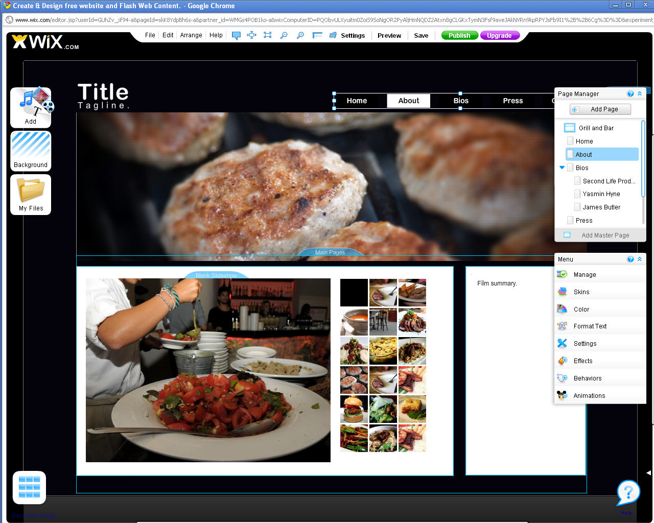
Production - Website Production.
We have now started to edit our website. As mentioned in my Website Planning post, our group has settled on Wix's "Grill & Bar" template


Production - Request for Permission to Film.
As our trailer script shows, we will be shooting one scene in a public fitness center. There are a few in our area, and our group has chosen to use the one at QE School in Wimborne, as one member of our group, Phoebe, used to be a student there, and the layout of their fitness center fits the layout we have pictured.
However, as it is a public fitness center, and is not owned by us nor our school, we sent them a request to film via email.
"Dear Sirs,
We are a group of A2 Media Studies students from Ringwood School. For our coursework, we would like to use your fitness center to shoot one scene. We would aim to film within the space of one hour, and there would be a group of four. (One actress, three production.) Would this be possible?
Kind regards,
Melanie Davis, Oliver Kent, and Phoebe Ward"
We received a polite response the next day, informing us that we will be able to film at the fitness center, provided that we give them two weeks' notice and come before lunch, as this is their least busy time.
Production - Cast.
We have now cast our film, so that, with our trailer scripted and arranged, we are prepared to film. We have cast two members of our group for two minor roles, as our main priority for those is that we use people who we have faith are reliable. We have cast outside our group for our three main roles, however, as our main priority for those roles is that we use actors who are skilled and fit the character description, as this will support the verisimilitude of our film.
Our cast are, in order of appearance;


Our cast are, in order of appearance;

Yasmine Hyne as Cindy

James Butler as Cindy's Boyfriend

Adele Ward as Cindy's Mother

Phoebe Ward as Cindy's Friend
Planning - Title Ideas and Audience Feedback.
With our filming script finished and the production of our supporting media (poster and website) underway, our group now has a very clear vision of our film and its message, and are able to start discussing potential titles.
We are all agreed that our main theme is our protagonist's struggles with her weight as she pursues entering the modeling industry, and that this should be reflected within our title. This lead us to list various "keywords" associated with extreme dieting and modeling, such as; weight, size, measure, thin, figure, image, face, perception, beauty. From these we were able to draw up three potential names, all of which we would be content to attach to our film. These are; Thinspiration, Extreme Measures, and Weighted Decision.
As we have three potential titles which we, as a group, feel could all work for our film, we turned to our potential audiences for feedback about which they feel is the most intriguing; the one which would be most likely to draw them to see our film, which, of course, is our main objective.
I made a basic survey for us to use to collect the opinions of our potential audience, and also to get to know a little bit about them. For example, we know that our target audience is females 18-34, so by including those surveyed's genders and ages in with their feedback, we can get an idea of which title is the most popular overall, and which is the most popular with our target market.
We are all agreed that our main theme is our protagonist's struggles with her weight as she pursues entering the modeling industry, and that this should be reflected within our title. This lead us to list various "keywords" associated with extreme dieting and modeling, such as; weight, size, measure, thin, figure, image, face, perception, beauty. From these we were able to draw up three potential names, all of which we would be content to attach to our film. These are; Thinspiration, Extreme Measures, and Weighted Decision.
- Thinspiration is drawn from our protagonist's initial "inspiration" to start modeling and, as a result, extreme dieting. We feel that it highlights her obsessive nature about pursuing both. It is also a reference to the real world pro-anorexia websites which bring together communities of extreme dieters to share tips and images of their "thinspirations"; often the thinnest of models.
- Extreme Measures is drawn from our protagonist's determination and will to do whatever it takes to succeed. The "Extreme" portion of the title is a direct reference to her extreme dieting, and the "Measures" references her reasons for her actions; to fit into the fashion industry's small standard sample size. The "Measures" portion would also reflect the image on our poster, should we chose to use one of the designs featuring a tape measure.
- Weighted Decision is drawn from the drastic decisions our protagonist makes in her pursuit to be a model; in particular her decision to follow an extreme diet to drop her weight. We feel that the title highlights just how drastic a decision this is, with the "Weighted" portion of the title not only being a reference to what the decision is concerning, but also the impacts it has on her life.
As we have three potential titles which we, as a group, feel could all work for our film, we turned to our potential audiences for feedback about which they feel is the most intriguing; the one which would be most likely to draw them to see our film, which, of course, is our main objective.
I made a basic survey for us to use to collect the opinions of our potential audience, and also to get to know a little bit about them. For example, we know that our target audience is females 18-34, so by including those surveyed's genders and ages in with their feedback, we can get an idea of which title is the most popular overall, and which is the most popular with our target market.


Friday, 8 April 2011
Planning - Website Design Ideas.
Having researched various promotional websites for other films of our genre, our group has started to design the website that we will be making to promote our film/trailer.
Although, as a group, we would be capable of building a basic website from scratch with HTML, we want to be able to make the best website possible, hence we'll be using the online software at http://www.wix.com to build our website.
We have discussed the content that we would like to host on our website; we liked the way that the "Picture Me" website hosted all of the posters on the homepage, and we would like to do something similar with our poster and, if possible, our trailer too. We also liked the way that the website for "The Social Network" opened with a page of reviews, and, whilst we couldn't be quite so showy with our "reviews" as a multi-award winning and anticipated film, we would like to host a press page.
Regarding the design, we would like to combine the simplicity of the "Picture Me" website, with the flash/interactive elements of the website for "Twelve". This is because we like these elements, and also because these are websites for films which also target our demographic, hence we should be looking to learn as much as possible from them.
With these ideas in mind, we started looking through all of the templates that Wix offers, and settled on a few to decide between.


This is the second template that we looked at, called "Makeup Artist". It is quite similar to the first template, as it is also in the portfolio style that we liked. We weren't so keen on the colors with this one as we were with the minimalistic palette of the first, but we could change this. We liked that we could use the top half, the main image, to display a key section of our poster, and use the icons at the bottom to show screenshots from the film; the differentiation between poster and screenshots that this template offers is better than the first. This template also has support for pages, and the tabs which direct to them are more visible. However, the area for information on the homepage is very small, and whilst we could add more information across various pages, it is best that we can host quite a lot on our homepage to be able to communicate with the website's more passive audience.


Although, as a group, we would be capable of building a basic website from scratch with HTML, we want to be able to make the best website possible, hence we'll be using the online software at http://www.wix.com to build our website.
We have discussed the content that we would like to host on our website; we liked the way that the "Picture Me" website hosted all of the posters on the homepage, and we would like to do something similar with our poster and, if possible, our trailer too. We also liked the way that the website for "The Social Network" opened with a page of reviews, and, whilst we couldn't be quite so showy with our "reviews" as a multi-award winning and anticipated film, we would like to host a press page.
Regarding the design, we would like to combine the simplicity of the "Picture Me" website, with the flash/interactive elements of the website for "Twelve". This is because we like these elements, and also because these are websites for films which also target our demographic, hence we should be looking to learn as much as possible from them.
With these ideas in mind, we started looking through all of the templates that Wix offers, and settled on a few to decide between.

This is the first template that we looked at, called "Photo Focus". The image on the right is one of a set, which changes every few seconds as part of a flash sequence. We liked the simplicity of this template, and thought that we could use the flash slideshow to show our poster, as well as some screenshots from our film. Whilst the template has used the sidebar to show just the name of the photographer, we feel that it is long enough for us to fill with more information, such as a summary, a release date, etc. The tabs at the bottom link to other pages, on which we could host even more information, and some interactive features. We also liked the portfolio style of the website; as our target audience is interested in fashion and the arts, it could be an aesthetic which will appeal to them.


This is the third template that we looked at, called "Japanese Bar". It's quite different to the other two, using a tiled layout rather than a portfolio aesthetic, but we like that this offers us more space for information on our homepage, and the ability to differentiate between the sections of information. We also liked that it included a space to feature a video, as we could feature our trailer there.

This is the fourth, and final, template that we looked at, called "Grill & Bar". We liked that it offered all the features of "Japanese Bar", including video hosting, but in a much more organized way, which we think will be better for communicating information to our audience. There are several templates for other pages, linked via tabs at the top, which use flash and are very interactive for our audience, which we think would be good for sustaining their attention and creating more opportunities for them to consume more information.
Overall, after discussing the pros and cons of all four templates, we have decided that we will use the fourth, "Grill & Bar". Whilst we liked the portfolio aesthetics of the first two, they made it more difficult to communicate information, and the third was a little disorganized. The template that we have chosen incorporates all of the features that we had discussed using, plus, if we remove the background image and use a minimalistic color palette, is quite simple and clear.
Wednesday, 23 March 2011
Research - Analysis of "Twelve" Trailer.
Above is the trailer for "Twelve", a film that I touched upon in my website research; I mentioned "Twelve"'s similar target audience/nature to our film, hence have chosen to look into its trailer in more detail.
I think this trailer is excellent, its pace and use of music being engaging in particular.
The start has a retrospective feel, with the film's protagonist, White Mike, at a low point, whilst flashing back to memories of his late mother. I like this as a start to a trailer; the mysterious element to his misery draws an audience in, whilst the flashbacks begin to reveal his story. The slow, tired music emphasizes the sequence's emotion, as does the washed out color filter.
This moves into a sequence of scenes set against a backing track of MGMT's "Kids".
(Analysis.)
Wednesday, 16 March 2011
Research - Analysis of Film Websites.
As well as our trailer and poster, we will be creating a website as part of our film's promotional package. Before we start designing our website, I have looked into the websites for other fashion media products targeted towards our demographic to draw inspiration from.
The first that I looked at was the website for the film documentary that I have mentioned in previous posts, "Picture Me".


The first that I looked at was the website for the film documentary that I have mentioned in previous posts, "Picture Me".

This website is very minimalistic, with a clean layout that makes the information available easy for the audience to consume. The homepage features the film's title, summary and background, release dates, and promotional posters. I like that all of the vital information for the audience is available upon first entering the website, and, thanks to the clean layout, can be consumed even subconsciously. Should one want to find out more, there are tabs at the top leading to content specific pages such as "Press" and "Bios", and at the bottom are links to the international release posters for the film. Whilst I like the minimalism for its ease of navigation and information consumption, I do wonder whether it could be a little plain which, despite their having all the information about it, may not not entice our audience to come and see our film.


The above screenshots are from the website for the film "The Social Network", which differs quite a lot to the website for "Picture Me". "The Social Network" is another film that targets our demographic in terms of age, but with less gender specific targeting; the website's much darker theme could even suggest more of a male gaze. However, the darker theme of the website could also be a reflection of the darker themes within the film, such as those that our group has in our film.
The first page one is directed to is not the homepage; it is a long list of awards the film has won and its positive reviews. This is a quite effective technique for interesting an audience IF one's film has a plethora of awards and reviews to post; in our case, our film is a new film using unheard of actors etc, hence, this is not a technique we can draw any inspiration from.
Clicking through to the homepage presents a tiled layout, with each tile linking to a section on the actor shown or the area of production shown (e.g. filming locations, editing, etc.), and hovering over the tile before clicking brings up a brief summary of the section. I do quite like the tiled layout; it's almost like a mood board, hence gives the audience an overall "image" of the film. Its main downfall is that it doesn't make vital information like the film's/the film's DVD's release date clear, the audience has to click through the tiles or the tabs at the top to find everything.
I think this is an excellent website for a film which has a star studded cast and an anticipated release without as much need for promotion. I like the use of the tiled layout, and could see it incorporated into our website somewhere, but not covering the entire homepage for our site; as less well known filmmakers, we need to use an approach more similar to the "Picture Me" website, making our film's vital information very clear on the homepage and easy to consume.

This website is for the film "Twelve". "Twelve" targets our demographic both in terms of age and gender, and approaches many of the same deglamorizing themes that we will be representing in our film/trailer. "Twelve", based on a book of the same name, is about a group of privileged teenagers in Manhattan who's obsessive focus on outward appearance and reputation, and the resulting reliance on party drugs like Twelve, has horrifying consequences. The film's dark themes have been reflected with the website's color scheme; black background, blood red detailing, and a stark white font that contrasts and stands out. After seeing a dark theme used on both this website and the website for "The Social Network", I think it could be used on our own; but, with a more minimal aesthetic, as we are not making a borderline horror film like "Twelve" or a male targeted film like "The Social Network".
As with the website for "Picture Me", this website includes all of the vital information information on the homepage, which I think is something that we definitely need to do on our film's website. Unlike the "Picture Me" website and more like the "The Social Network" website, this website uses a collage effect with cast pictures and the trailer in the middle; I like the use of the trailer as part of the collage, and think this could be a good idea for our website as, of course, our trailer will be the main component of our promotional package and we should feature it as much as possible.
This website is a little less disorganized to the eye than the "Picture Me" and "The Social Network" websites, which is something that I would like our group to avoid as much as possible as it does make information more difficult to consume.
Monday, 14 March 2011
Production - Final Plot.
Our group has now settled on our final plot for the full theme. After each of us writing one based on the themes and their links that we had discussed before, we came together to compare them; and chose Phoebe's as the one that we will use. Both Ollie and I inputed a few ideas from our own plots which were incorporated within Phoebe's;
"An 18 year old girl has been influenced by magazines and music videos to become a model. She becomes inspired by a certain photographer and model and starts looking up modelling agencies on the internet to start her modelling career. She finds a website that requires a portfolio of photos so she asks her long term boyfriend to take the pictures for her. He knows how hard it is to get into a modelling industry but is supportive enough to take the pictures; he doesn’t quite take her seriously but likes the novelty of having a model as a girlfriend.
The pictures are sent off to the agency she waits anxiously for 3 weeks before she eventually gets a reply saying she is not the right build and the agency’s models are a size 6 or lower, this affects her confidence but she is determined and starts to diet and go to the gym. From a size 12 she gets down to a size 10 in a month, she gives up through frustration and decides that food is the problem so starts to eat less and less. Her family notice and confront her, when she tells them they don’t support her and they tell her to concentrate on something more productive because modelling is unhealthy and won’t give her a future. She refuses to give up on her dream and looks to the internet for more answers.
She comes across an online chat service and meets a girl who tells her she has recently got into an agency and is working as a model. The main girl is in awe of the chat girl and asks for advice, the chat girl tells her that stopping eating only bloats her and that eating then bringing it back up makes you slimmer. The main girl doesn’t like this idea but as she has stopped dieting and is having to eat normally in front of her parents it has been harder for her to lose weight. She starts being sick after meals and she notices she has gone down to a size 8 in less than a month. However, this affects her mood and her boyfriend notices their relationship suffering as she keeps more secrets from him and chooses to exercise rather than meet up with him. He goes round to her house without her knowing and is let into her room, he sees her magazines all around the room and then notices a log she has kept showing how many calories she may have digested during the day and the amount of hours she is been exercising. He confronts her and she shouts at him telling him to keep out of her business, he tells her he is worried about her and that she has to stop and he won’t let her carry on. He convinces her to start eating again. The main girl confides in her online friend telling her she cannot lose weight because of the people around her. The girl tells her that the other option is cocaine and gives her details of a dealer in her area. It takes a couple of days before she makes the decision to go buy some cocaine she meets the dealer and nervously tells him why she is buying it he replies telling her she is really attractive and will definitely make it, this encourages her further to reach her modelling career. She holds off using the drug for a long time as she knows it is wrong but is torn between her passion for modelling and what is the best thing to do. She makes a line of the drug on her desk and goes to snort it the camera focuses on surrounded by pictures of her friends and boyfriend.
Her boyfriend is then seen reading an email saying he has been offered a job in London; he is excited but concerned for his girlfriend it then cuts to her weighing herself and looking at herself in the mirror sucking in her stomach. She then has an email from an agency arranging a meeting to have some practise shots in London she is very excited. Both boyfriend and girlfriend travel to London together however the girl tells her boyfriend she will be shopping while the boyfriend has told her he will be meeting up with some old friends. It then double screens to the boyfriend shaking meeting a man for his meeting and the girl meeting the photographer it then shows the boyfriend sitting down at a desk and the girl standing in front of a backdrop. Fades to blackout still split screen shows the boyfriend leaving smiling and the girl leaving looking worried and upset.
They both meet in the car and hardly speak to each other. Blackout. Girl is seen on the floor of her room crying with an envelope from the agency on the floor in front of her. Her boyfriend walks in also with an envelope in his hand and smiling. He sees her crying on the floor and runs to her he asks what is wrong but she says nothing, he takes the envelope off the floor and opens it, she grabs it shocking her boyfriend who then starts to fight for the envelope there is a struggle and he manages to open the envelope and see the photos inside, he is shocked and destroyed at the nude images of her obviously looking uncomfortable. He tells her she has gone too far and that he was worried to tell her he had got a job in London and he was moving away but that her decision had made his a lot easier, he storms out the room and the girl is left to cry on the floor.
The main girl to talk to her online friend and continues to take cocaine and get skinnier. Her parents notice but her relationship with them is ruined she no longer listens to them and shuts herself in her room. She is a little more cautious about other agency’s but she is getting more offers than ever and now sees her 1st shoot as experience her attitude has changed and she becomes numb. She is seen going to another photo shoot involving other people her dressing room consists of two other women who hardly to talk each other, she goes over to talk thinking because they are modelling they have something in common, they look her up and down laugh and ignore her. So the girl goes to the toilets and snorts more cocaine showing she has become reliant on cocaine for her emotions also. The shoot is about girls in their pyjamas having a pillow fight due to her unsuccessful attempt to talk to the girls she finds it hard to act as if she knows them and is having fun, she is thrown off the photo shoot which makes her extremely angry she goes back to her room rips up all her magazines but stops at one from her favourite photographer.
She is seen having many pictures taken but none are successful she realises that there is more to modelling than being skinny there is technique as well she starts taking more cocaine and losing more weight. She turns up to a photo shoot looking tired and ill she is taken to make up and the woman tells her she looks awful the girl snaps at her and the woman refuses to do her make up telling her she will never get anywhere with such a bad attitude. The girl does her own make up and goes in for the shoot he tells her she looks fabulous and takes the photos enthusiastically telling her she is exactly what they wanted. After shaking hands with the photographer she leaves happy, a week after the photos are printed in magazines and on billboards as the girl who is in need of mental help new makeup and products and even one showing her as a woman suffering from a sexual disease reading ‘if you could see aids would you still take her home?’. She is horrified to see the pictures everywhere her parents throw her out of the house and she is left to live on the streets.
Her boyfriend is then seen leaving a building in a suit and tie he is catching a bus when he gets given a leaflet by a girl wearing a t-shirt saying aids awareness it has his girlfriend’s picture of her looking terrible. He instantly starts to worry about her and tries to call her there is no answer. He then calls her parents they answer but tell him they do not know who the girl is, this worries him more and he sets off to try and find her.
While walking through the subway to her house he sees a homeless person on the floor he walks straight past them and she looks up after him it’s the girl. He tires all night to find her but fails. He walks back the homeless person is missing but as he gets to his car he sees the homeless person standing by his car, he then realises it is his girlfriend. He runs up to her as she faints into his arms he starts to cry and there is a blackout. She is seen in a hospital environment with her boyfriend by her side she wakes up and he starts to tell her that her organs had started to fail she may have brain damage from lack of food and the cocaine use he tells her he never wanted to leave her on her own but he lost it and he will be there from now on. She spends days and days in hospital recovering and her boyfriend is there every day. Her parents eventually turn up her mum in tears and they are happy she is getting better. She says she still wants to model but she has learnt from her lesson, it then cuts to a couple of years on both her and her boyfriend are hand in hand looking up at a billboard for a lead brand with the girl on it."
Of course, this is a plot for a full theme, and we are creating a trailer. Hence, our group sat together and worked through the plot, scrutinizing it and considering which scenes are best for us to show in our trailer. Conventions of trailers for all genres command that a trailer present the film's most important themes without giving too much of the story away. Hence, we wanted to work in a chronological order as our film's themes interconnect and flow into one another, but we had to pick a point at which to stop our telling of the story.
Below are a few snapshots of the process we went through; highlighting key scenes and annotating certain with ideas that struck us of how we could manipulate them to show just enough but not too much.


With the scenes that we will be using in our trailer selected, we will now have to do some more focussed research into how trailers for films of our genre are constructed and write a "trailer script" for the construction of our own trailer.
Planning - Poster Design Ideas.
I have started drafting a few ideas for our poster's potential layout. All three are very basic sketches, as their primary purpose is for our group to gain an idea of the composition options for our poster, and for us to start planning which one would be best to promote our film and how we could shoot and edit it.

This first option shows our an extreme close up of our protagonist's face and neckline, with her being "strangled" by a tape measure. This composition suggests the pressure that our protagonist is under as an aspiring model, in particular due to weight issues. However, it could have more of a horror genre connotation.

This second option is also an extreme close up, this time of our protagonist's waist, and also utilizes a tape measure as the main focal point. I have used the tape measure again as I think it is a good symbol for our film; weight issues will be prevalent, and will be the cause of our protagonist's downward spiral into other issues. Setting it against her waist rather than her face took away the horror connotation the previous poster could have had, and also stops the audience from being distracted between two focal points (the actress's face and the tape measure). With the former poster, we would have had no visible clothing on our model, as only her face and shoulders were on view, similar to the "The Beautiful Life: TBL" nude shots, however with this poster we would have her in simple blue jeans and a white vest (which we would offset the title); still keeping her a blank canvas, vulnerable to corruption.

This third option takes a different direction to the previous two posters. We have our protagonist dressed in the same blue jeans and white vest as in the former poster, for the same reasons, but we have her in a long shot showing her full body rather than an extreme close up of a specific area. In the foreground, there is a camera showing a retouched, clichéd "model-esque" image of our protagonist, in full hair and make up, on the display screen. The camera is pointing towards the "real" depiction of our protagonist; a very vulnerable looking girl, in plain clothes, with invisible hair and make up. The use of composition and contrasts in styling are to symbolize our film's exposing the real model, not the one the camera creates. However, unlike the former two drafts with their use of the tape measure, this poster does not pick up on particular themes or the downward spiral our protagonist will experience, and the more detailed layout may be more difficult for passing audiences to read messages from.
Research - Analysis of "The Beautiful Life : TBL"'s Advertising Campaign and Others.
With our plot themes finalized and the writing of our plot underway, it is now time for our group to start shifting some focus onto our supporting products; we will be making a poster to advertise our film and a website to complete our promotional package.
Before we start drafting ideas for our poster, I have done some research into posters for other films which also target our female 18-34 demographic and/or are of our genre. As this article on Empire Online highlights, particular genres have particular clichéd conventions in the way that their posters are constructed; hence, I will be looking out for conventions that I can spot within the posters I will be looking at.
The first, and main, advertising campaign that I will be looking at is the one for the television show "The Beautiful Life : TBL", as, despite the show's eventual failings, it was a successful, well targeted campaign for a show which explores similar themes to our own film and was produced for a television network which targets the same demographic as our group.
"The Beautiful Life : TBL" utilized both print and online media for its promotional campaign; as we will be with our poster and website. The show was promoted through the acclaimed cast's Twitter feeds, attaching to each Tweet a TwitPic of one of the show's posters bearing the tagline "What are you looking at?", to reach a mainstream audience, and during New York Fashion Week through New York Magazine, with the event's 4000 well connected attendees receiving an edition of New York Magazine featuring an ad spread for the show, to pique the interest of their more specific target audience.
Above are the four posters that were used for the show's main campaign, featuring nude shots of the four principal cast members, shielded by a banner containing the show's title and tag line.
The first message that these posters convey is that the life of a model is going to be stripped bare; as represented with a literal visual metaphor. I like the way that these posters have conveyed this message, as it is simple, eye-catching, and the message is easy to interpret - even at a glance. As we will be attempting to strip the falsehoods of the modeling industry away with our film/trailer, the message that these posters are attempting to convey and the way that they convey them could be of inspiration to our group.
The second message that these posters convey is more of a statement about the characters; all three of the characters who are established models (top left, Ashley Medekwe as Marissa; bottom right, Sara Paxton as Raina; bottom left, Corbin Bleu as Isaac) are facing the camera in a full body long shot, which, combined with their body language, symbolizes their confidence. The character who is an aspiring model, new to the industry (top right, Ben Hollingsworth as Chris), is facing away from the camera and has a far more timid and unsure body language. As our protagonist is an aspiring model, our group can draw more inspiration from the representation of Ben Hollingsworth's character Chris and "his" poster.
In summary, things that I liked/think our group could draw inspiration from :
The literal metaphor used to convey the "stripped bear" message.
The simplicity of the campaign; it's eye-catching and makes it easier for an audience to consume information at a glance.
The composure of the top right, Ben Hollingsworth as Chris, "aspiring model" poster, and the actor's body language.
Things that I didn't like/don't think our group can draw inspiration from :
The "confidence" of the composure of and body language used in the other three posters; connotes a model with more experience and industry knowledge than our own protagonist.
The "retouched" look of the posters; the aim of our film is to show a less glamorous side to the modeling industry, a more realistic and relatable take, hence we should convey this within our poster.
Some other posters which target our demographic that I have looked at, based on previous research, include:
This poster for ABC family's television series "Beautiful People". Like the posters for "The Beautiful Life: TBL", this poster is very simple and, to a lesser extent, eye-catching. What I like about/can draw inspiration from this poster over the posters for "The Beautiful Life: TBL" is the less retouched look, the less glamorous aesthetic. "Beautiful People" was about a family moving to Manhattan from New Mexico, hence their uncertainty about their new environment is not dissimilar to the uncertainty our character would be feeling, and has been represented in a similar way in this poster to the way that we could in our poster. The less glamorous/less confident approach this poster has taken contrasts with:

This poster for The CW's television series Gossip Girl. Whereas "Beautiful People" was showing the lives of a less glamorous family living in NYC, as we will be showing a less glamorous side to modeling, "Gossip Girl" heightens the glamor in all of its themes; and this is represented with its poster. All of the characters in the "Gossip Girl" poster look confident and comfortable in their environment; aside from Penn Badgely as Dan and Taylor Momsen as Jenny, who's characters are new to the Manhattan high society environment and have this uncertainty represented with a similar turned away/less confident body language to the "The Beautiful Life: TBL" poster with Ben Hollingsworth.
Sunday, 13 March 2011
Planning - Plot Ideas.
Having completed a lot of research towards our film's plot, our group now feels at a stage where we can start to piece our plot together. To start, we looked at the themes which have arisen from our research; a development on the basic themes of our genre (for the general aesthetic of our film/trailer) which I mind mapped for us before.
As we did find that mind map so useful for organizing our ideas, I have produced another with these new, plot-centric themes, and included straight line links between each theme to show where we could build story lines. (Made with Photo Layout on the Apple iPad.)

As we did find that mind map so useful for organizing our ideas, I have produced another with these new, plot-centric themes, and included straight line links between each theme to show where we could build story lines. (Made with Photo Layout on the Apple iPad.)

Our themes are quite serious, as we are aiming to show the darker side to the modeling industry. We are targeting a mainstream female 18-34 demographic, not just the fashion obsessed niche, hence have chosen themes that are both associated with the fashion/modeling industry and relatable for our audience; such as eating disorders, relationship issues, and feelings of naivety and vulnerability.
With this as our basis to work from, each member of our group is now going to work independently on a plot line that represents all of these themes and works with the connections drawn between them. We will then come together, compare plots, choose one as the "main", and incorporate a few strong ideas from the other two to finalize it.
Research - Analysis of Past and Current News Stories.
As mentioned in my previous research post, about documentary "Picture Me : A Model's Story", it's important for our group to be looking at factual media as well as fictional to ensure that the plot line for our film has a high level of verisimilitude and accuracy. Hence, I have researched the three biggest news stories in fashion from 2010 for our group to use when constructing our film's plot.
I drew these stories from mainstream media sources that would appeal to our target demographic of females 18-34 (magazines such as Grazia and Look, and online magazines/blogs such as Vogue.co.uk, New York Magazine's "The Cut", and Fashionista.com) to ensure that these stories will be familiar as well as accurate. I have summarized them below.
Nothing shook the fashion world quite as much during 2010 than the suicide of designer Lee "Alexander" McQueen on February 11th. He was one of the most creative and innovative designers of our time, having had his technical skills honed at the prestigious London fashion school Central St Martins and on Savile Row. His decision to take his own life at the height of his career highlights the pressure the fashion world, with its fast pace and constant scrutiny, places upon those who work within it.
In March, Danish model Rie Ramussen came forward to confront acclaimed fashion photographer Terry Richardson, who once worked with her on a Gucci campaign, at a party in Paris. She accused him of using his clout to sexually harass young women aspiring to be models. "They are too afraid to say no because their agency booked them on the job and are too young to stand up for themselves. I told him, 'What you do is completely degrading to women. I hope you know you only f*ck girls because you have a camera, lots of fashion contacts and get your pictures in Vogue.'"
Days later, another model named Jamie Peck came forward and detailed her two shoots with Terry Richardson. She quoted him as saying (about breaking into modeling), "It's not who you know, it's who you blow. I don't have a hole in my jeans for nothing."
Over the weeks and months that followed, several more models came forward, adding fuel to the fire of rumors that had been circulating about Terry Richardson's lewd behavior, in particular towards young models, within the industry for years.
Stories like the Terry Richardson scandal and the release of the "Picture Me" documentary raised awareness of the issues young models face, leading to the first ever fashion week to proceed under a collective agreement between models and designers. (London Fashion Week Spring/Summer 2011.) The UK model union reached an agreement with the British Fashion Council to govern working hours, break times, minimum rates for fashion shows (most shows used to pay "in trade"; e.g. in clothes), etc. These provisions sound basic, and they are. The modeling industry at present lacks almost any regulations whatsoever, and models, as independent contractors and often minors, are very vulnerable to exploitation.
These stories have enabled our group to pull together more themes which we could represent in our film/trailer. The emphasis of these stories is on the pressures of the fashion/modeling industry and the vulnerability of new models, and the Terry Richardson story in particular brings up the sexual harassment theme that was touched upon in the "Piture Me" documentary.
I drew these stories from mainstream media sources that would appeal to our target demographic of females 18-34 (magazines such as Grazia and Look, and online magazines/blogs such as Vogue.co.uk, New York Magazine's "The Cut", and Fashionista.com) to ensure that these stories will be familiar as well as accurate. I have summarized them below.
- Lee McQueen (of Alexander McQueen)'s suicide :
Nothing shook the fashion world quite as much during 2010 than the suicide of designer Lee "Alexander" McQueen on February 11th. He was one of the most creative and innovative designers of our time, having had his technical skills honed at the prestigious London fashion school Central St Martins and on Savile Row. His decision to take his own life at the height of his career highlights the pressure the fashion world, with its fast pace and constant scrutiny, places upon those who work within it.
- Terry Richardson's sexual harrassment scandal :
In March, Danish model Rie Ramussen came forward to confront acclaimed fashion photographer Terry Richardson, who once worked with her on a Gucci campaign, at a party in Paris. She accused him of using his clout to sexually harass young women aspiring to be models. "They are too afraid to say no because their agency booked them on the job and are too young to stand up for themselves. I told him, 'What you do is completely degrading to women. I hope you know you only f*ck girls because you have a camera, lots of fashion contacts and get your pictures in Vogue.'"
Days later, another model named Jamie Peck came forward and detailed her two shoots with Terry Richardson. She quoted him as saying (about breaking into modeling), "It's not who you know, it's who you blow. I don't have a hole in my jeans for nothing."
Over the weeks and months that followed, several more models came forward, adding fuel to the fire of rumors that had been circulating about Terry Richardson's lewd behavior, in particular towards young models, within the industry for years.
- London Fashion Week models unionized :
Stories like the Terry Richardson scandal and the release of the "Picture Me" documentary raised awareness of the issues young models face, leading to the first ever fashion week to proceed under a collective agreement between models and designers. (London Fashion Week Spring/Summer 2011.) The UK model union reached an agreement with the British Fashion Council to govern working hours, break times, minimum rates for fashion shows (most shows used to pay "in trade"; e.g. in clothes), etc. These provisions sound basic, and they are. The modeling industry at present lacks almost any regulations whatsoever, and models, as independent contractors and often minors, are very vulnerable to exploitation.
These stories have enabled our group to pull together more themes which we could represent in our film/trailer. The emphasis of these stories is on the pressures of the fashion/modeling industry and the vulnerability of new models, and the Terry Richardson story in particular brings up the sexual harassment theme that was touched upon in the "Piture Me" documentary.
Friday, 11 March 2011
Planning - Mood Board.
As our group have now settled on our target demographic and the theme for our film/trailer, we have started looking at various sources of media for ideas and inspirational content that will be useful to us during our production. I have looked at examples from three forms; advertising, television, and film, to gain as much information about how our genre should be targeted as possible. As a group, we have been looking at the print media that our demographic would be interested in reading; being a fashion conscious female between the ages of 18-34, these have included the "younger" fashion and lifestyle magazines such as Glamour, Cosmopolitan, Elle, and Teen Vogue. Whilst we have studied traditional Vogue and other higher brow fashion publications such as Harper's Bazaar and Tatler, this has been more so for detailed insight into the fashion and modeling industry rather than for insight into how to target our audience. The more traditional, high brow print fashion publications tend to target a wealthier, more intellectual, fashion niche, whereas, producing a film for general release, we need to be more open.
Below is the mood board that I have created for us to use, based upon the group's and my own research. Our target demographic being quite social media and fashion conscious, I have been using the internet (fashion blogs in particular) and magazines as my primary source for content. I constructed the mood board using Adobe's Photoshop CS5.

I have attempted to represent the direction that we, as a group, see our film going in. I have used an organized, tiled layout with all of our themes, major and minor, mixed in with each other to be able to glean a clear idea of what sort of image we and our film/trailer will be depicting.
Research - Analysis of "Picture Me : A Model's Diary".
"Picture Me : A Mode's Diary" is a documentary made by (now) former model Sara Ziff and director Ole Schell, which charts Ziff's rise to acclaim and discusses well and lesser known controversies associated with the modeling industry. It was released to audiences in late 2010, and won several prestigious awards, including "Best Fashion Film" at the Milan International Film Festival.
It's interesting for our group to look at, as it touches on and gives examples of the themes we will be representing in our fictional film/trailer, but in a non-fictional context. It is essential that we look at documentaries like this to find factual inspiration, as we would like our film/trailer to have as high a level of realism and verisimilitude as possible.
Themes from the film that we are discussing showing in our own include:
We have also looked at the film's trailer, to learn from its construction and the editing of those scenes which present similar/the same themes as those that we will be exploring.
(Trailer analysis.)
US Release Poster for "Picture Me".
As the poster above suggests, the movie looks behind the scenes at the lives of the models featured in the glamorous advertisements we come into contact with every day, exposing both the highs of the career (representing and walking for some of the world's top fashion houses, the Fashion Week after parties, and a six figure salary) and the lows (maintaining an abnormal shape to suit the industry's unrealistic demands, the degradation, the exhaustion, and the more common low salary - making it hard to cover even the rent alone in one of the world's fashion capitals).
It's interesting for our group to look at, as it touches on and gives examples of the themes we will be representing in our fictional film/trailer, but in a non-fictional context. It is essential that we look at documentaries like this to find factual inspiration, as we would like our film/trailer to have as high a level of realism and verisimilitude as possible.
Themes from the film that we are discussing showing in our own include:
- Differences between the lives of the few top models and an aspiring model.
- Issues with image.
- Sexual harassment.
We have also looked at the film's trailer, to learn from its construction and the editing of those scenes which present similar/the same themes as those that we will be exploring.
(Trailer analysis.)
Wednesday, 2 March 2011
Research - Analysis of "The Beautiful Life : TBL".
"The Beautiful Life : TBL" was a television drama centered around models living and working together in New York City, which was produced for and aired on The CW network in the US during September 2009 and was due to be aired on Channel 4 in the UK, as announced prior to the show's cancellation.

("The Beautiful Life : TBL"'s show title card.)
As "The Beautiful Life : TBL", overall, is an example of a media product of our genre which wasn't a success, there's little from its actual production that we have been looking at with the intention to imitate or draw inspiration from (though we have looked at a few episodes to attempt to pinpoint where they went wrong and learn from their mistakes); however, certain aspects are proving useful to us to look at and draw inspiration from.
For example, the show's advertising campaign. Somewhat surprising considering the show's almost immediate cancellation, the advertising campaign was considered a success. The campaign generated a buzz about the show, to the extent that (ironically) after the Pilot was presented, The CW ordered a full season of episodes for the show, and several iconic figures were confirmed as guest stars; including coveted designers Zac Posen (New York-based), Erin Fetherston (New York-based), and Matthew Williamson (London-based), who's transatlantic bases (and Channel 4's picking the show up before it's airing) suggests that anticipation for the show managed to spread from the US to the UK.
I believe the show's marketing's one downfall was that it was too well targeted, creating a niche audience that resulted in the show's low viewer numbers. For The CW network, this would seldom be an issue - the entire network is targeted towards females 18-34 (the same demographic to which we are targeting our film), with each show fitting certain niches.
For example, The CW's current "big hit", "Gossip Girl", still fails to pull in viewer numbers greater than "The Beautiful Life : TBL" did each week, supporting itself through the buzz it receives from its cult following - the fashion crowd and their impressive media - and, somewhat therefore, product placement.
However, "The Beautiful Life : TBL" was launched during an inevitable cut causing recession, and, as it was targeted towards the fashionable audience that "Gossip Girl" had already attracted, The CW may have made the decision to cut a new show without offering it a chance rather than to cut one of their established shows.
However, "The Beautiful Life : TBL" was launched during an inevitable cut causing recession, and, as it was targeted towards the fashionable audience that "Gossip Girl" had already attracted, The CW may have made the decision to cut a new show without offering it a chance rather than to cut one of their established shows.
As our group will be working on promotional ancillary tasks to compliment our film trailer, we will be looking at "The Beautiful Life : TBL" and its advertising campaign, having been a success with our target audience despite the show being a failure on its network, in greater detail in the near future.
Subscribe to:
Posts (Atom)